
05
PACKAGING LABELLING DEVELOPMENTS. THE IMPACT OF PACKAGING LABELLING ON RECYCLING – IS THERE A BETTER WAY?
DONNA ABDELRAZIK
ABSTRACT
Waste from packaging and its impact on the environment have been gaining exposure as a results of the increase of media coverage, corporate and global ecological initiatives taking shape, and public sustainability concerns impacting purchasing decisions. In theory, municipal recycling programs are a positive solution to support a circular economy for packaging waste. Still, less than 10% of what Toronto, ON, Canada consumers place at the curb is recycled back into our packaging value chain. This study was initiated to understand what impact, if any, does package labelling have on recycling engagement (symbol vs colour vs text). Participants expressed their confusion around the current recycling label methodology and the differing municipality recycling processes across Canada. Uncertainties are contributing to errors and contamination in our blue bins. In this study, a single-use coffee cup container was designed and prototyped with four labelling alternatives. Survey respondents preferred the version with text and colour added to the recycling symbol to increase its understanding. Consumers have identified a need for transparency to minimize these inconsistencies. A better way forward for recycling engagement is to create:
- A harmonized system that is visually consistent
- An accessible design
- Cost supportive for print and operations
- With informative and intuitive labelling iconography
If we can connect experiential pre-conditioning to a universal visual alongside increased awareness, change is possible.
INTRODUCTION
In the Greater Toronto Area (GTA), the government, industry stewards, and taxpayers support more than a million dollars a day to transport waste and recycling around the city (Wilkins, 2017). The Ontario Stewardship Council runs the Blue Box program that collects printed paper and packaging, and the cost is divided amongst the municipalities. Ontario’s Blue Box program was the world’s first curbside recycling program that began in 1981 and has since “become the blueprint of over 150 countries around the world” (“The Story”, n.d.). Although it is convenient for consumers to place all paper and packaging products into a single blue box, what real impact is this infrastructure having on our environmental stewardship and recycling success? Is there a better way to support proper consumer participation in recycling efforts? This study was initiated to understand what impact, if any, does package labelling have on recycling engagement (symbol vs colour vs text).
METHODOLOGY
A choice-based survey was conducted to learn the current recycling habits and consumers’ opinions. One hundred seventy participants from across North America, Europe, Asia, and Australia provided their insights into their current recycling programs and offered feedback on improving participation. Due to COVID-19, on-line survey offering was the method of distribution; however, the initial scope included a focus group platform with prototype interaction to understand the labelling impacts on user-experience.
74% of those participating were women. The generational demographic was evenly split, with half of the respondents 41 years or older (52%) Gen X to Baby Boomers and the other half (48%) Gen Z to Millennial 18-40. This organically offered a platform to find cause-and-effect relationships between these demographics using design of experiments (DOE) to process affecting factors. Qualitative commentary and summative evaluation, quantitative techniques and statistical analysis were conducted to assess the data received and support conclusions on what packaging labelling alternatives might aid in consumer participation efforts.
PACKAGE MEDIUM TESTED
This study focused on a Single-Use Beverage Container containing both a multi-material paper-based cup that is not recyclable and a polypropylene polymer lid that is recyclable through a cradle-to-cradle life cycle. “Estimates suggest that Canadians use between 1.6 and 2 billion disposable coffee cups a year” (Wilkins, 2017).
A fictitious brand, Coffee Ogler, was designed and developed with 3D renderings for this study to ensure participants focused on the questions and not a recognized brand. As shown in Figure 1, four different labelling alternatives were created, including print debossing of the text to support accessible universal design.
PACKAGING LABELLING ALTERNATIVES – COLOUR, TEXT, AND SYMBOL
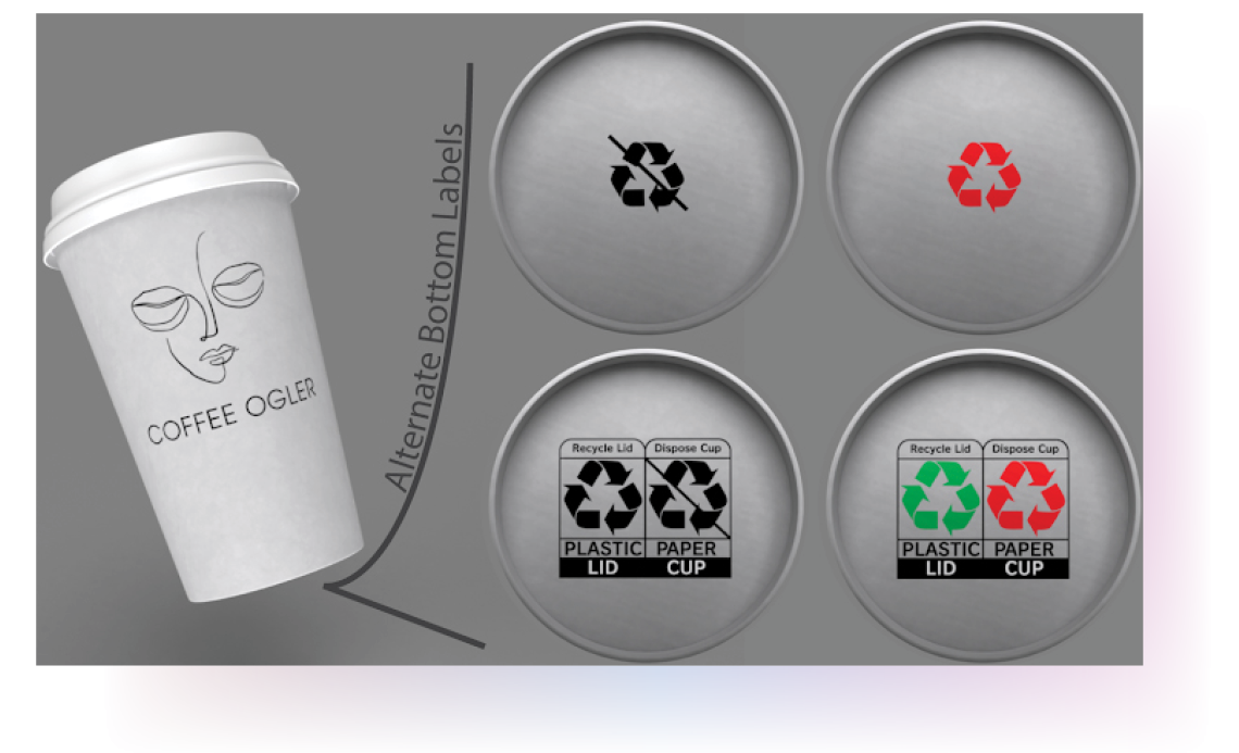
Figure 1. Coffee Ogler brand design and 3D rendering of four packaging labelling alternatives. Left to right, top to bottom: (1) black Mobius loop symbol, (2) traffic light colour Mobius loop symbol, (3) How2Recycle black text and symbol, (4) How2Recycle traffic light colour and symbol. Image created by Dorotea Bajic.
LITERATURE REVIEW
PACKAGING RECYCLING LABELLEING METHODS IN CANADA
Optically, Canadian consumers see a supportive systemic effort of identification and collection by way of labelled receptacles, efficient waste removal processes with curbside pickups or drop-off stations, and deposit system infrastructures for returnable packaging materials such as glass and aluminum. Additionally, Canadian consumers are familiar with the commonly used black Mobius loop symbol printed on the packaging, signifying that the container is recyclable and may be placed in a blue box for recycling. Unfortunately, the Mobius loop can be misleading or inaccurate if viewed as a blanket recycling symbol, as not all municipalities have the infrastructure to process every type of recyclable material. Additionally, different resin code identifications, biodegradable alternatives, and multi-layered packaging materials add to consumer confusion. The province of Ontario has 444 municipalities alone, and some Canadian cities—like Vancouver and Edmonton—have blue box programs that require consumers to separate paper, cardboard and containers, which only increases the risk of error. A study conducted at Queen’s University identified that “when people think their stuff is being recycled, it clears their conscience, no matter what is actually happening beyond the blue box” (Wilkins, 2017).
Would acknowledgement and public recognition of accurate recycling engagement impact participation? In June 2016, the Gold Star Recycler Program was introduced in the Windsor-Essex region, which rewards exemplary recyclers with gold recycling bins. To participate, residents register in the program and a Essex-Windsor Solid Waste Authority representative then evaluates the contents of their recycling bins on collection day; households that demonstrate compliance are honoured with a limited-edition bin. Data is still being collected on this initiative.
Municipal waste management apps are bringing recycling education into the digital age and attracting the Gen Z and Millennial demographic. Recycle Coach and Waste Wizard are two examples of available media tools that support local consumers in recycling protocols. With 50% of respondents surveyed in this research initiative making educated guesses about what bin they should use to dispose of their packaging waste, apps like these could increase awareness and education to improve consumer knowledge and accuracy.
IS THERE A BETTER WAY?
SUEZ, ON-PACK RECYCLING LABEL (OPRL) & HOW 2 RECYCLE
Waste management company SUEZ proposes a new packaging ‘eco-labelling’ concept in the UK that consists of a “three-tier traffic light code with red, amber and green versions of the…Mobius Recycling Loop” (Dickinson, 2018). Additionally, they suggest creating a numbering system that corresponds with product categories (not the resin identification code system currently in circulation), which would then be printed on recycling bins. This combined colour and numbering system, shown in Figure 2, would minimize contamination and error by providing visually enhanced recycling indication for consumers and making it clear in which bins items should be placed. This system could “encourage consumers to think more deeply about their purchases” (Dickinson, 2018) and may cause producer shaming, thereby affecting change at the design stage of corporate packaging development. Supermarket giant Tesco has also “set out goals to govern packaging and reduce plastic waste through a traffic light system” (Barrett, 2019). However, if their initiative is independent of SUEZ, will these efforts aid consumer recycling clarity or add confusion?
SUEZ, TRAFFIC-LIGHT RECYCLING SYSTEM PROPOSAL
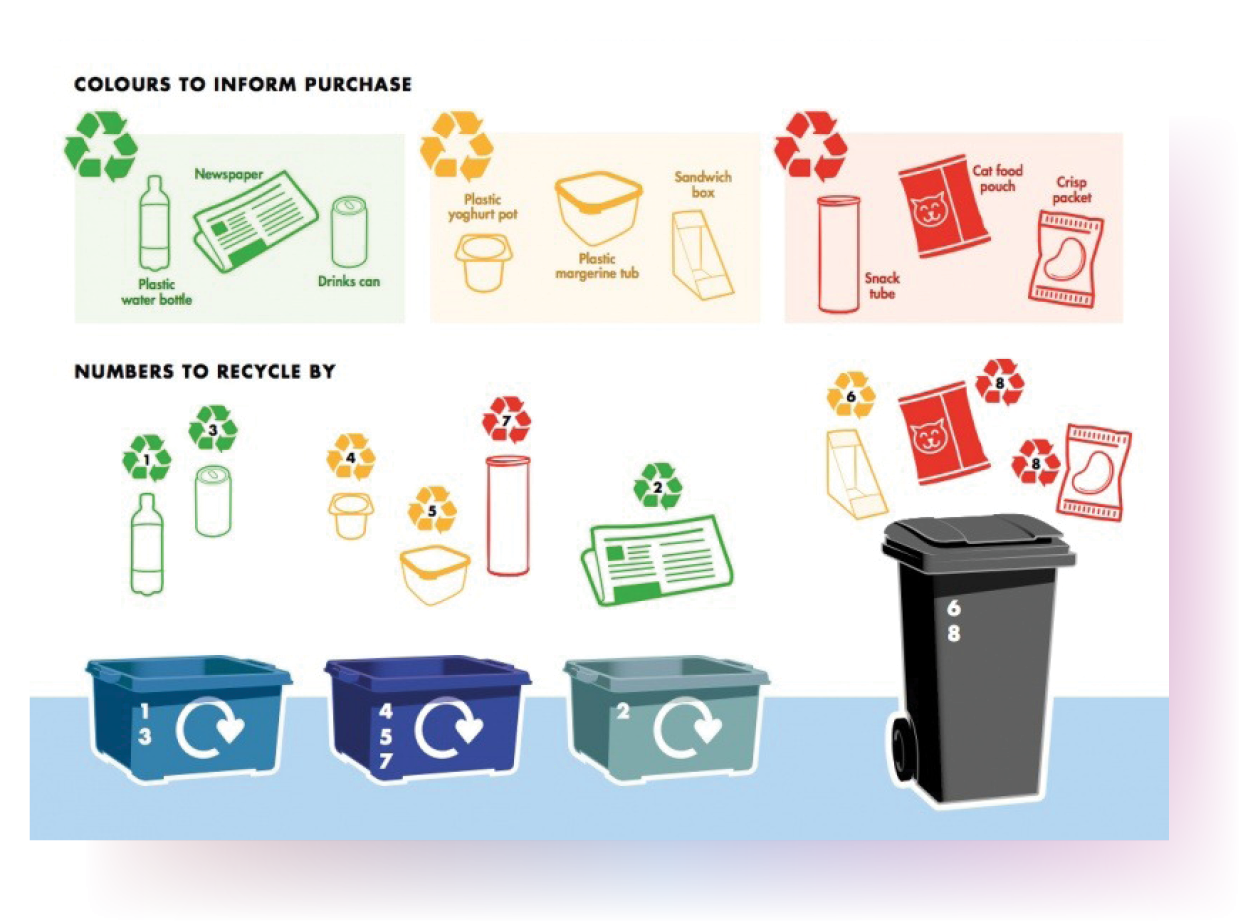
Figure 2. SUEZ, Traffic-light Recycling System Proposal for the UK. Retrieved from: https://resource.co/article/traffic-light-labelling-could-improve-packaging-recycling-says-suez-12894
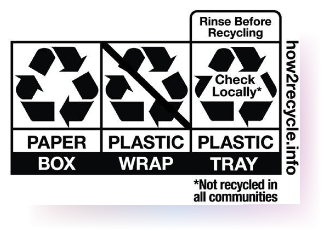
Has this traffic-light proposal arrived too late? On-Pack Recycling Label (OPRL) is a packaging labelling system that was implemented in 2009 in the UK that is now in the circulation of more than “80% of supermarket products, with all national supermarkets being members of the scheme” (Dickinson, 2018). This labelling method adds text descriptors to inform consumers of a product’s recyclability.
As seen in Figure 3, the OPRL European initiative is similar to the American brand coalition How2Recycle, which “[provides] a labelling system that follows the Federal Trade Commission Green Guides” (How2Recycle, n.d.) and is led by major US consumer packaged goods brand owners.
OPRL AND How2Recycle RECYCLING SYMBOL IMAGES
 |
|
Figure 3. Visuals of the UK OPRL recycling text & symbols and the US How2Recycle version Retrieved from https://www.oprl.org.uk/ & https://how2recycle.info/labels
In the 1990s, Japan introduced their recycling labelling version (see Figure 4). Based on the resin identification system, it has varying shapes and surrounding arrows to support visual differentiation at a glance (Gordenker, 2010).
PACKAGING LABELLING RECYCLING SYMBOLS IN JAPAN
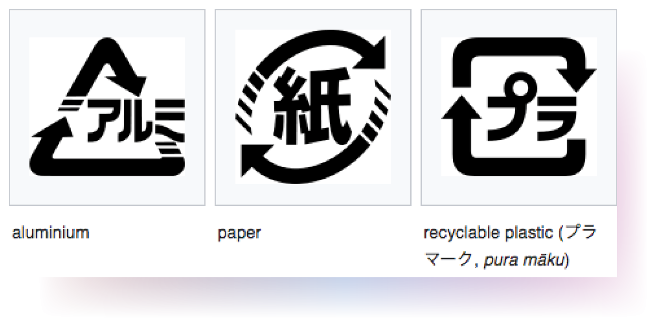
Figure 4. Visuals of the risaikuru shikibetsu hyoji (recycling identification symbols) in Japan. Retrieved from https://www.japantimes.co.jp/news/2010/02/18/reference/logo-for-recyclables/#.XuOeK55KhZ0
Each platform researched has a similar goal: to reduce confusion and create ease in recycling efforts for the consumer. However, these platforms are not unified in their representations, which may confuse consumers and waste management infrastructures when brands want to expand their global retail reach. A study done at the University of Zagreb on consumer interpretation of recycling symbols in Croatia corroborates the need for regulated, easily understood, and reproducible eco symbols that can be globally popularized (Dolic et al., 2015). A harmonized visual and system expectation is ideal for adoption, longevity, accuracy and efficiency, similar to how the Mobius loop has impacted the world.
When we consider packaging user experience, subconscious reactions to preconditioned visuals, like the Mobius loop, can create an emotional connection toward sustainability contributions. Additionally, information is power. Researchers from Pennsylvania State University and Boston College found that “people recycle more when they know what recyclable waste becomes” (Winterich et al., 2019). Therefore, if we can connect experiential pre-conditioning to a universal visual alongside increased awareness, the potential for change is possible.
THE PSYCHOLOGY AND MARKETING OF COLOUR, SHAPE, AND SYMBOLS
One of the current challenges with adding text versus colour to recycling labelling is in countries with multiple language guidelines. This increases packaging space requirements and makes for cluttered informational panels that may counter the intended effect. Additionally, offering various colour options for recycling symbols adds print costs to commodity-volume single-use items. A cost-benefit analysis would be required to evaluate the impact of these additional process requirements. Colour blindness is another aspect to consider if adding a colour-coded system.
Research has shown that many products’ success or failure can be directly linked to visual aspects of packaging design, and colour is the first element to “capture the shopper’s attention on shelf” (Spence, 2016). When considering a traffic light system, red can be seen from the furthest distance. It has the longest wavelength on the visible spectrum, and has been popularized for years as the colour of boldness and danger. Yellow is next on the visible spectrum to signify “caution,” with green following a close second to represent “go” (Miller, 2016). It could be argued that green also denotes growth and nature (Roberge, 2019), quickly tying an emotional connection to a well understood and trusted colour choice.
Significant studies on the mind have explored visual perceptions. “People fix and perceive pictorial elements like icons and illustrations faster than words” (Tubik Studio, 2016), which is why the design community often uses iconography to amplify informational meaning. Another critical finding is that “images are less vulnerable in combination with the background and surrounding elements while text is highly dependent on the aspect of readability” (Tubik Studio, 2016). One survey respondent remarked, “the colour draws your attention to the label, the symbol tells you very quickly what the label is about, and the words give you detailed instructions so that you don’t have to memorize the meaning of the symbols.”
THE DEMOGRAPHICS OF OUR RECYCLING INFLUENCERS
Generation Z, born between 1998 and 2015, comprises 25% of the population in Canada (about 9 million people), and is the generation to influence change. According to McArthur (2019), “they [want] to be shown, rather than told.” While always connected to some form of technology and social media platform, they use mobile food service and dine out on average four times per week. Unlike millennials, who were born between 1980 and 1994, “[Gen Z doesn’t] dine out because their lives are too busy for groceries and cooking…[they are] there because there’s something they’re craving” (McArthur, 2019). They have consideration for food waste and are mindful if the take-out container is recyclable or compostable. The use of an app and interest in information for this demographic are fitting. Therefore, recycling tools and added visuals and text descriptors within a recycling label would be recognized as positive attributes by this group. One of the Gen Z Canadian survey participants remarked, “If labels started adopting the words, I think it would greatly improve general recycling efficiency.” Millennials feel better recycling, and Gen Z feels the need to recycle. Each generation is more critical of sustainability, and our societal infrastructure is playing catch-up.
RESULTS AND DISCUSSION
INTEREST IN PACKAGING SUSTAINABILITY
When asked, respondents shared their level of interest in packaging sustainability (see Figure 5), which ranged from moderately to extremely interested.
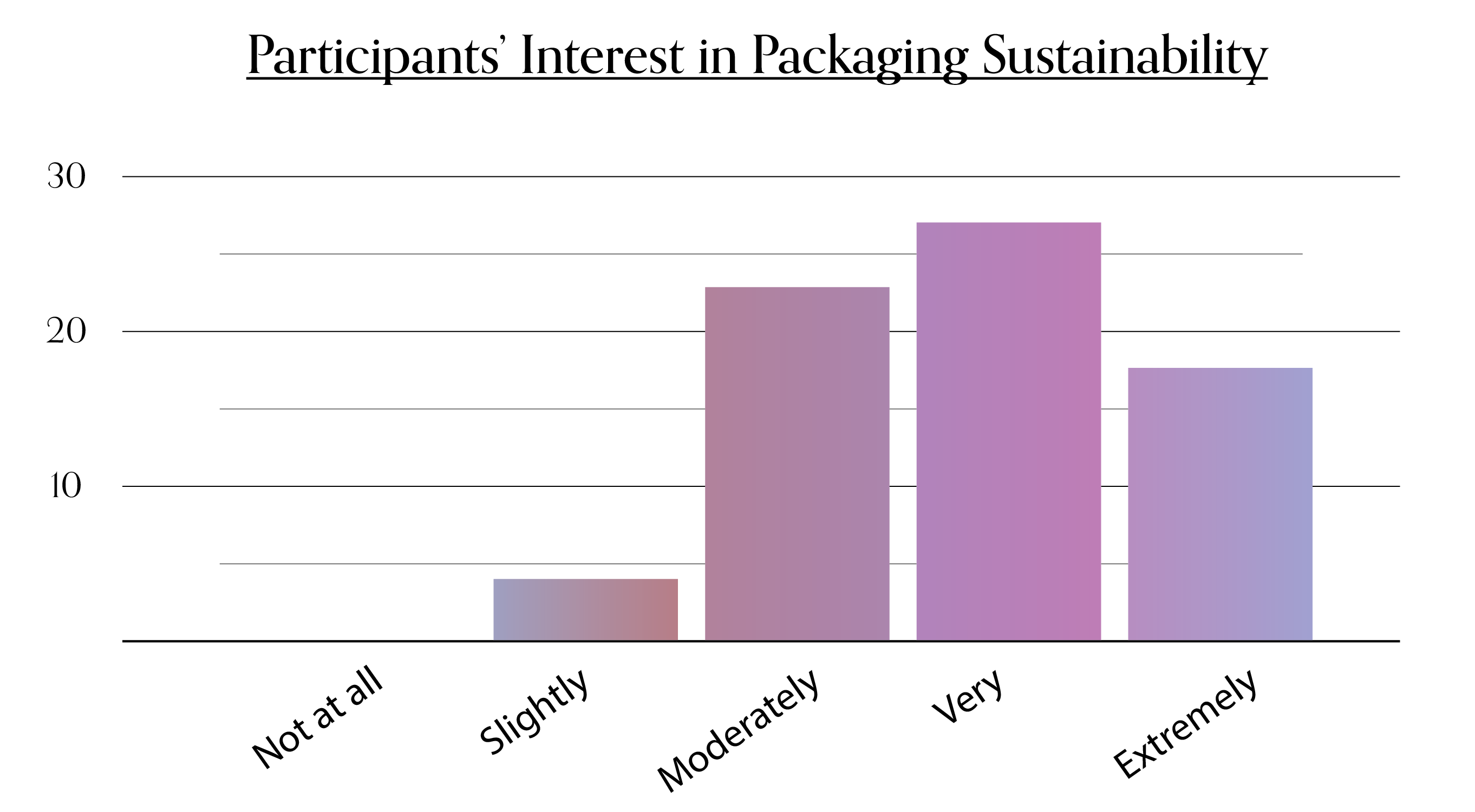
Figure 5. 70 respondents rated on interest in packaging sustainability. 94% were moderate to extremely interested in the subject.
By creating a scatterplot with the data using a quadratic polynomial of 2 with the same data, we can plot a predicted trendline using participant interest variables. As shown in Figure 6, the curve depicts an interest level of 4 (moderate) trend.
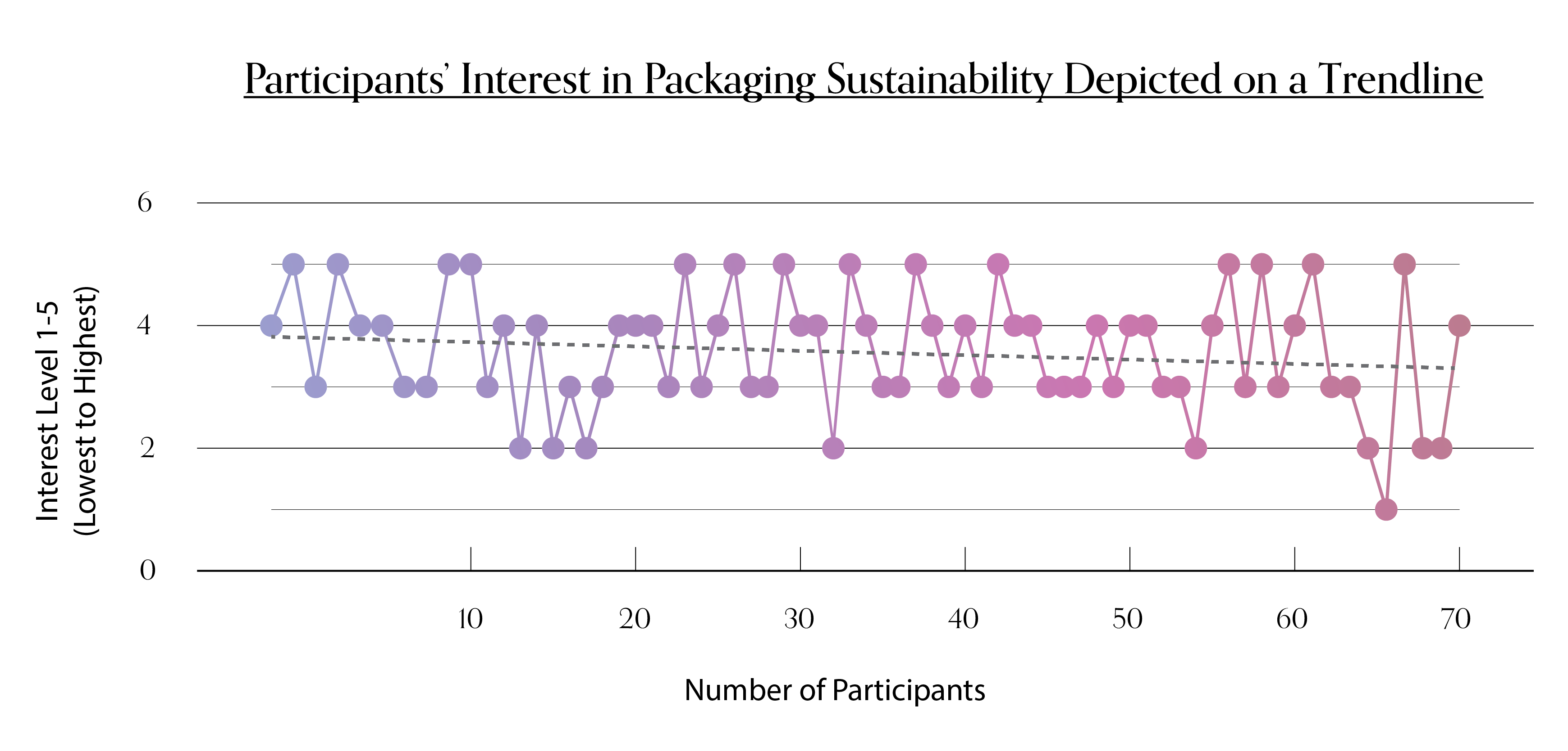
Figure 6. 70 respondents rated on interest in packaging sustainability. Quadratic Polynomial – order of 2 trendline.
PARTICIPATION AND UNDERSTANDING OF RECYCLING SYSTEM
98* of survey respondents participate in some form of recycling, and 77% are supported by curbside bin pickup. When deciding what packaging item is recyclable, 50% of respondents make an educated guess on which bin to place their packaging in. As shown in Figure 7, 58% believe they have an average understanding of their local municipal recycling system.
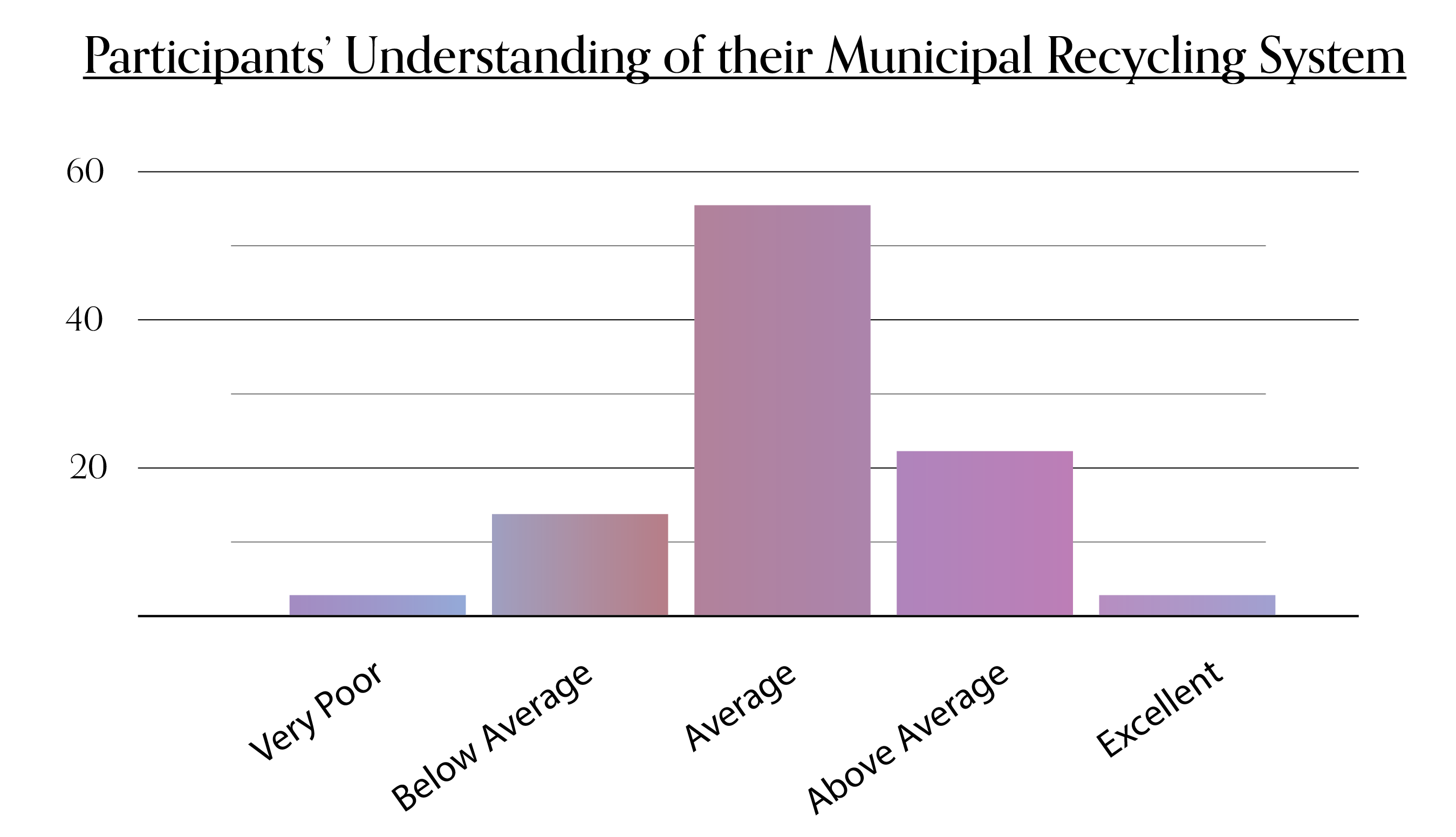
Figure 7. Response of 170 respondents asked about their understanding of their local municipal recycling system.
Curiously, participants were asked what their understanding of the Mobius loop symbol was, and 99% clearly knew that its message indicated the packaging was recyclable. This is a testament to global education efforts and established awareness this symbol has on consumer recognition. Participants were then shown a Mobius loop with the resin identification code number and acronym PP for polypropylene, and asked if they knew what was meant by these two details. Interestingly, 66% of Canadians did not know or erred in their response, whereas, outside of Canada, there was an opposite finding. 64% of respondents outside of Canada knew and accurately understood the resin code identification details. If recycling efforts are to improve, education for Canadians on the resin code identification system is necessary to better recycle accuracy of polymer packaging materials.
PACKAGING LABELLING IMPACTS
How is it possible to increase recycling engagement with packaging labelling efforts? Respondents were given four visual recycling labelling options to rank in order of preference (see Figure 8.1). They ranged from a black symbol, to a traffic light colour/symbol reference, to the addition of text, symbol and colour to provide complete informational guidance.
VERSIONS 1-4 OF PACKAGING RECYCLING LABELLING OPTIONS
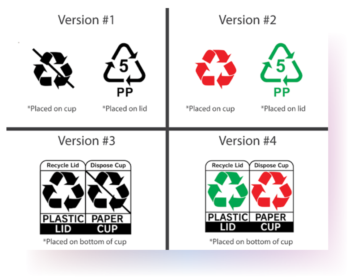
Figure 8.1. Packaging labelling options.
Figure 8.2. Response of 170 respondents rated on preference scale against packaging labelling.
As shown in Figure 8.2, the 170 respondents, the highest labelling preference was the full text, colour and symbol recycling image, whereas the least preferred was the one-colour black Mobius loop. When isolating Gen X and Baby Boomers, they selected the colour graphic over text option. Presbyopia is a condition of farsightedness related to ageing and may be a contributing factor to the preference (NVISION Eye Center, n.d.). One Baby Boomer respondent surveyed shared, “I think colour-coded symbols are easiest to understand, most people don’t want to take the time to read labels, and the print is often too small to read.”
As discovered, 76% of respondents said they would be influenced to participate in recycling if it was easier to understand (see Figure 9). We learned from the research that the resin code identification system is misunderstood by a significant percentage of Canadians surveyed (66%); therefore, there is an opportunity to improve for our interested demographics. Considerations include increased recycling app investment, and social media advertising to educate our tech-savvy Gen Z and Millennial demographics in the resin code identification system and municipal recycling protocols. The platforms could also seek feedback on improving or harmonizing the communities’ packaging value chain recycling infrastructure.
Figure 9. Response of 170 respondents asked about recycling participation.
When isolating the pure symbols from the options with text, 57% of participants agreed that colours were easier to understand in packaging labelling. However, when there is text included, the responses do not lean either way in preference in the inclusion of colour. This could be because they believe the text covers what the colours communicate and more, leading to their indifference. (See Figure 10 below).
Figure 10. Response of 95 respondents asked if colour was easier to understand over symbols in packaging recycling labelling.
Consumers found text instructions on packaging easier to understand (see Figure 11). This could be because text provides more clarity to the current commonly-misunderstood resin code identification system. The icons require further education to ensure that consumers will interpret the meaning correctly. One respondent proposed “words would be of value for a transitional period until there could be reasonable confidence that the symbols are well understood.”
Figure 11. Response of 95 respondents asked if symbols were easier to understand over text in packaging recycling labelling.
CONCLUSION
Packaging labelling has the opportunity to impact engagement and compliance with the Gen Z demographic as they are passionately active to learn and “totally connected to the sum of human knowledge and information” (McArthur, 2019). In fact, there is a preference when adding colour and text to the recycling symbols. As discovered, packaging recycling labelling is not only often misunderstood by consumers, but it is also not unified in representations worldwide. One Canadian survey respondent remarked that they wished there was more transparency: “it seems that nobody really knows what is recyclable and how the municipal recycling process works, so just having more clarity would reduce the amount of confusion and possibly motivate more people to participate in recycling efforts.”
There is a better way forward for recycling engagement to create a harmonized system that is visually consistent, with impactful, accessible, and informative labelling iconography. An overall thread throughout the research findings and survey feedback highlighted one significant theme:
AN INCONSISTENT SUSTAINABILITY INFRASTRUCTURE
Consumers are identifying a need for transparency. There is confusion surrounding recycling labelling, and varying municipality recycling processes in Canada are contributing to the inaccurate disposal of packaging materials in recycling bins. Additionally, multiple labelling systems across the globe contribute to the uncertainty of recycling directions. According to a survey respondent, “symbols or coloured symbols are of value but only if the symbols and/or colours are universally understood.” Recycling education, harmonizing infrastructures, and labelling clarity are elements that will influence future consumer participation in packaging waste recycling.
REFERENCES
Barrett, A. (2019, November 11). TIPA CEO Says Tesco Should Reconsider Packaging Strategy. Retrieved from: https://bioplasticsnews.com/2019/11/11/tipa-ceo-says-tesco-should-reconsider-packaging-strategy/
Dickinson, K. (2018, October 11). Traffic light labelling could improve packaging recycling. Resource Media. Retrieved from: https://resource.co/article/traffic-light-labelling-could-improve-packaging-recycling-says-suez-12894
Dolic, J., Pibernik, J., & Bilusic, I. (2015). Consumer Interpretation of Recycling Symbols used for Printed Products. University of Zagreb, Faculty of Graphic Arts.
Essex-Windsor Solid Waste Authority. (n.d.). Gold Star Recycler Program. Retrieved from: http://www.ewswa.org/recycling/gold-star-recycler-program/
Gordenker, A. (2010, February 18). Logo for Recyclables. Retrieved from: https://www.japantimes.co.jp/news/2010/02/18/reference/logo-for-recyclables/#.XuOYw55KhZ0
How2Recycle. (n.d.). About How2Recycle. Retrieved from https://how2recycle.info/about
McArthur, J. (2019, July 11). Generation Z is here: Are they millennials 2.0 or a whole new breed of consumer? Restaurants Canada. Retrieved from: https://blog.restaurantscanada.org/index.php/2019/07/11/generation-z-millennials-2-0-whole-new-breed-consumer/
Miller, A. (2016, June 10). The reason traffic lights are red, green, and yellow. Thrillist. Retrieved from: https://www.thrillist.com/cars/nation/traffic-light-colors-history
Roberge, D. (2019, March 27). What does your package color mean to consumers? Industrial Packaging. https://www.industrialpackaging.com/blog/package-design-color-for-the-consumer
Save your city’s recycling program. (n.d.). Municipal Media Ink. https://recyclecoach.com/
Spence, C. (2016). Multisensory packaging design: Color, shape, texture, sound, and smell. In P. Burgess (Ed.), Integrating the packaging and product experience in food and beverages: A road-map to consumer satisfaction (pp. 1-22). Woodhead Publishing.
NVISION Eye Center. (n.d.). The relationship between age and farsightedness (presbyopia). Retrieved from: https://www.nvisioncenters.com/farsightedness/and-age/
The Story of Ontario’s Blue Box. (n.d.). Stewardship Ontario. Retrieved from: https://stewardshipontario.ca/download/the-story-of-ontarios-blue-box/
Tubik Studio. (2016, May 13). Visual perception: Icons vs copy in UI. UX Planet. Retrieved from: https://uxplanet.org/visual-perception-icons-vs-copy-in-ui-cd8e1a2f8af0
Wilkins, C. (2017, November 4). Canada’s dirty secret, Canadian geographic. Retrieved from: https://www.canadiangeographic.ca/article/canadas-dirty-secret
Winterich, K., Nenkov, G., & Gonzales, G. (2019, May 16). Knowing what it makes: How product salience increases recycling. Science Daily. Retrieved from: https://www.sciencedaily.com/releases/2019/05/190516103712.htm
![]()