
1. Aspects of Web Accessibility Auditing
Things to Watch For
 It is important for Lulu and her team to realize that the barriers that exist in their web content are not necessarily unique and that one thing that simplifies the job of a web accessibility auditor is that there are a relatively small number of issues that occur over and over again. Being aware of these common barriers means it is often possible to quickly scan through content and identify most accessibility issues. Lulu and her webmaster should become familiar with the following list of the top ten potential barriers to watch for, and you should too! It is by no means a complete list, but represents the most common accessibility problems.
1. Images without a Text Description
Images without a text description will be inaccessible to those who are blind. Text descriptions are typically added using the "alt" attribute with the HTML img element. Note that the length of alt text should be no longer than 125 characters. Screen readers will typically stop reading the text at that point. If a longer description is needed, there are a variety of ways to describe the image further, either in the surrounding text, in a figure caption, or using the ARIA attribute aria-describedby. ARIA will be discussed further in Unit 8. In each case alt would still be used to provide a brief description and refer to the longer description elsewhere.
Technical: Using the alt attribute to refer to a longer description <img src="abelincoln.jpg" alt="Abraham Lincoln at his desk, see description below" / >

In the image above, Abraham Lincoln is preparing the text for the Emancipation Proclamation. Several others are seated around the desk, consulting with Lincoln on the document.
Images of text will also be inaccessible to blind users, and also potentially inaccessible to people with low vision, who may attempt to magnify the image resulting in the text often degrading to the point that it becomes unreadable. People with reading disabilities who use reading software may also have trouble with images of text as they cannot be read by the software.
There are occasions where images are strictly decorative or contain no useful information. In such cases the alt attribute should still be used, but its value left empty (i.e., alt=""). This forces a screen reader to ignore the image. If an empty alt attribute is not included, screen readers will read the file name of the image, which can interfere with comprehension of the surrounding information, or leave a screen reader user wondering if they are missing something in the image.
2. Functional Elements That Only Work with a Mouse
People who are blind are not likely to use a mouse when operating a computer (though there are some that do). Most rely exclusively on a keyboard to navigate through page features. Any element that only operates with a mouse will not be accessible to blind users. People with limited mobility may rely on a keyboard. People with low vision may also rely on keyboard access. “Power users” also tend to use a keyboard to navigate more than average users. Usability will be affected for all of these people when keyboard access is missing.
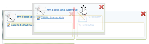
Figure: Drag and Drop elements should be controlled by keyboard, or an equivalent alternate provided
3. Text That Looks Like a Heading, But Is Not
People who are blind and using a screen reader to navigate through web content will have a feature in the screen reader to list the headings on a page, so they can potentially jump to any one of those headings and begin reading. The list of headings also provides a good overview of the content on the page, making it easier to find specific information. When “heading-like” presentation of text is used (e.g., making the text bold and large), the structure provided by proper headings will be missing, requiring these users to navigate through the entire page to discover its content. This greatly increases the effort needed to move through web content. Always be sure proper HTML headings are used to represent page sections instead of styled text.
Technical: Using proper headings:
Accessible:
<h1>The Last Chapter</h1>
Inaccessible:
<p style="font-size:22pt; font-weight:bold;">The Last Chapter</p>
Likewise, headings should not be used to style large bold text, where the text is not a heading or section title. This creates confusion when listening to a heading list with a screen reader.
4. Links That Do Not Describe the Destination or Function
Like headings, screen readers can list all of the links on a page to gather a summary of the resources that lead from it. If the link list is made up of meaningless phrases like “click here” or “this link” or “more”, little or no useful information is provided to the screen reader user. For most users, meaningless links like this make content more difficult to use. If you are able to see, imagine yourself coming across these links and having to read through the surrounding text to figure out where the link leads, or having to click the link to discover its destination.
5. Lists That Look Like Lists, But Are Not
Screen readers will recognize a properly-formatted list using HTML ordered or unordered list markup (OL or UL), announcing the list and the number of list items, and indicating one’s position in the list while navigating through it. This information helps with memory and comprehension. Without the proper list markup, more effort is often required to comprehend a list of items.
6. Missing “Within-Page” Navigation
You have already been introduced to two potential ways to navigate within pages, using headings and links. There are a variety of other ways to move around within pages, such as providing “bypass links,” often created to allow assistive technology users to skip over repetitive elements like navigation menus, and jump to an anchor further down the page. ARIA landmarks can also be used for this purpose, assigning specific roles to elements (e.g., banner, navigation, main) that can be listed by screen readers and directly jumped to (e.g., <div role="main">...</div>). Without ways to navigate within a page, screen reader users may be required to move through the content in sequence from beginning to end to find the information they are looking for, which requires a lot of unnecessary effort.
7. Poor Visibility, Contrast, or Use of Colour On Its Own
Providing good contrast between text and the background on which it appears is important for a variety of reasons. For those with low vision, or for older readers, text may become unreadable if it does not contrast well with the background. Using an image as a background can also be problematic, particularly when content resizes and text moves over various shades of dark and light, making parts of the text difficult to read.
The visibility of the cursor’s focus indicator is also important when navigating using a keyboard. Someone with low vision who may have the screen magnified several times may find it easier to navigate with a keyboard than a mouse. If they are unable to see where the keyboard focus is located, keyboard navigation becomes difficult or unusable.
As an example, you may come across a feature that uses a green start button and a red stop button. Some colour blind users or those with low vision may not be able to tell the buttons apart. Adding the words “Start” to the green button, and “Stop” to the red button provides the extra indicator in addition to colour.
8. Video with No Captions (Or Automatic Captions)
It is quite common nowadays for organizations to host their video collections with services like YouTube or Vimeo. It is important that any meaningful spoken dialogue in the videos be captioned so the content of the audio track is available to those who cannot hear it. Obviously this will include people who are Deaf, but it might also include people watching the video in a noisy environment, or watching with the sound turned down where quiet is necessary.
YouTube now provides automated captioning. It takes the audio track from the video and uses voice-recognition technology to convert the sound to text. This can be a handy feature to quickly caption a video, but video producers must not rely on automated caption to provide captions for their videos. The accuracy rate in many cases will be quite low, to the point where the captions make no sense.
The automated captions can be used as a starting point for manually-generated captions, but are not considered to be an acceptable alternative to the audio track in a video for accessibility purposes. There are a variety of free tools now available, such as YouTube’s caption editor or the Amara caption editor, that make it relatively easy for anyone to create captions.
Here’s an example of what can happen with automated captions.
Video: When YouTube Automatic Closed Captioning Goes Wrong
© McMaster Libraries. Released under the terms of a Standard YouTube License. All rights reserved.
9. Information That Updates without Reloading the Page
It is very common nowadays for parts of web pages to update automatically with new information, such as news feeds or Twitter feeds, for example. Screen readers typically take a static snapshot of a web page before they start reading, so any new information that might be added to a page after loading will generally go unnoticed. When updated content is presented on a site, it must be formatted in such a way that screen reader users are informed of the changes.
Fortunately, with the emergence of ARIA, providing the updates to screen readers is relatively simple. Developers must add a “live region” where updating information is present, using the “aria-live” attribute within the element containing the updating information.
A live region added to a div.
<div aria-live="polite">updating information goes here</div>Note that the value for aria-live specifies when the content of the region gets announced. The “polite” value in the example means the updates are announced when the screen reader is not reading something else. You may also use the value “assertive” which interrupts the screen reader to read the updating information. Developers can also add the aria-relevant and aria-atomic attributes to define what gets read when a live region updates: aria-relevant set to “additions” for new content, “removals” for items removed, and “all” to announce both, and aria-atomic set to “false” to announce only the changes, or “true” to announce the live region as a whole.
10. Tables Presenting Data That Have No Row or Column Headers
When navigating through tables containing data using a screen reader, it is often necessary for screen reader users to know the column or row headers to determine the meaning of data in a table data cell, particularly for larger tables where it is difficult to track one’s location auditorily in the table. For table header cells to be readable from within a data cell (TD) they must be marked as a proper table header cell (TH).
For more detailed information and further reading, you may wish to review:
Readings and References:
