
3. Automated Testing Tools
Colour Contrast Evaluation
Colour Blindness Simulations
Colour Contrast Testers
A quick search of the Internet for “colour contrast test” should turn up a variety of tools you can use to test contrast. Here, we will mention the WebAIM Color Contrast Checker, but if you prefer another, you can add it to your Toolkit.
Why Colour Contrast Is Important
You may recall from the unit Introduction to WCAG 2.0 that WCAG 2.0 Guidelines 1.4.3 and 1.4.6 address accessibility issues associated with colour contrast. These two guidelines are presented below. Note the contrast ratios at each level (4.5:1 & 3:1 at Level AA and 7:1 & 4.5:1 at Level AAA for smaller and larger text respectively).
1.4.3 Contrast (Minimum): The visual presentation of text and images of text has a contrast ratio of at least 4.5:1, except for the following (Level AA):
- Large Text: Large-scale text and images of large-scale text have a contrast ratio of at least 3:1
- Incidental: Text or images of text that are part of an inactive user interface component, that are pure decoration, that are not visible to anyone, or that are part of a picture that contains significant other visual content, have no contrast requirement.
- Logotypes: Text that is part of a logo or brand name has no minimum contrast requirement.
1.4.6 Contrast (Enhanced): The visual presentation of text and images of text has a contrast ratio of at least 7:1, except for the following (Level AAA):
- Large Text: Large-scale text and images of large-scale text have a contrast ratio of at least 4.5:1.
- Incidental: Text or images of text that are part of an inactive user interface component, that are pure decoration, that are not visible to anyone, or that are part of a picture that contains significant other visual content, have no contrast requirement.
- Logotypes: Text that is part of a logo or brand name has no minimum contrast requirement.
Some accessibility checkers will have colour contrast evaluation built into them (e.g., AChecker), but others will not.
Technical:
There are many colour contrast evaluators from which you may choose to support your contrast testing (see some suggestions below). Using any of these tools requires gathering the colour codes from the elements being evaluated. There are a variety of ways to find these codes, though the easiest is to use a browser’s “Inspect” feature. You can inspect the colours in the right frame, as shown in the figure below.
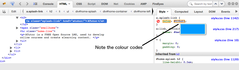
Figure: Inspect panel showing the colour codes in the Style pane to the right
Once you’ve tested a few colour combinations you’ll quickly develop a “feel” for good contrast, and be able to quickly scan a page and identify where contrast may not be sufficient. You can test the specific colours associated with those elements you’ve identified in a scan. There are tools, however, that will evaluate all the colours on a page (e.g., AChecker) – this may be preferable if you are reviewing a site that seems to have multiple contrast issues.
For a walk through the WebAIM colour contrast checker, watch the following video:
Video: Checking Colour Contrast
The Anatomy of a Colour Contrast Results Screen
In the figure below you can see the foreground colour (#007ac6) and background colour (#ffffff) codes entered into the respective fields. Below that you will see the compliance status for Normal and Large text, at Level AA and Level AAA. In this case the colours contrast well enough to pass at Level AA (4.57:1), but for smaller text the contrast ratio fails at Level AAA. Sites should aim for Level AA contrast, but if feasible try for Level AAA compliance.
Note the lighten and darken links next to the colour input field. You can click these (on the test site) to adjust the colours so they will pass, then take the resulting colour codes and replace the existing codes to adjust the colour on the site being evaluated so it complies.
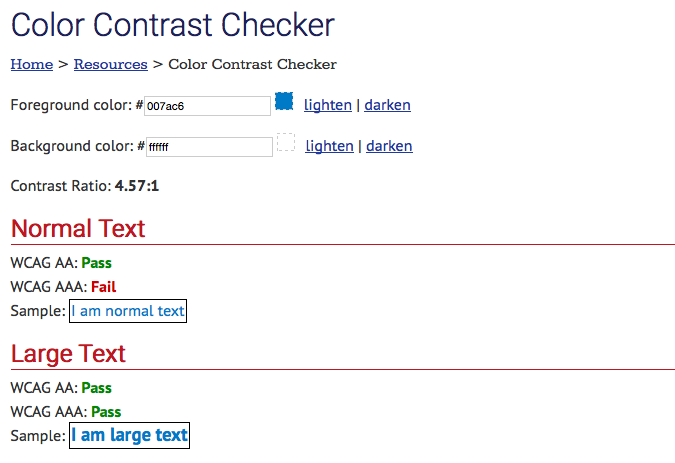
Figure: The WebAIM Colour Contrast Checker
Other Contrast Testers
Here are a few other colour contrast testers you may want to experiment with:
