
Part 3 • Student Contributions
Accessible Design
Loren Amaral
Contributed by Loren Amaral, GCM ’21
In a time where inclusion is more prominent than ever, it’s important that we do our part as creatives to inform ourselves and promote the use of accessible design. Accessible design can be seen in every industry from automotive, to design, and retail, to name a few. Within each of these industries, if each designer is practising accessible design, then they are ultimately learning to improve their target market’s user experience. Before we begin, it is highly recommended that you look into certifying yourself with The Accessibility for Ontarians with Disabilities Act (AODA) [New Window] course, in order to learn more about accessibility and how you can introduce it to your own processes.
What is it?
In order to define “Accessible Design” we must first look at three concepts pertinent to this topic:
- Accessible Design: is the process in which the needs of people with disabilities are specifically considered.
-
- Example: If a medical clinic recognizes that their clients are primarily older and have a difficult time navigating their front steps, they should consider accessible design by investing in a ramp or elevator.
- Universal Design: is a broader concept, in which the design of products and environments are usable by all people, to the greatest extent, without the need for specialized design.
-
- Example: Doors, curbsides, and windows are examples of accessible design that allow for users such as baby strollers, delivery workers, and people with disabilities.
- Usable Design: is a form of testing within the design process. It is defined as the “effectiveness, efficiency, and satisfaction” process. This is when engineers test their designs through user experiences to further learn and improve operational functions.
-
- Examples: Surveys, reviews, user stories, etc.
Now that we’ve reviewed these concepts, we can better define accessible design as “The combination of the technical and the user experience (UX).”
Accessible Product Design
This is a relatively recent invention called a Timer Cap, which allows users to set a timer on their pill bottles. This is useful for those that are forgetful, or for those that can’t open consume pills until a specific time.

Users
Accessible Design would not be possible without recognizing its users, and more specifically, people with disabilities. In Ontario alone, 15% of our population has been diagnosed with some form of disability. These disabilities take a wide variety of forms, ranging from mobile to emotional, and are most prominent in those age 75 and older. One perspective to consider when designing: Ask yourself, “Will I be able to read this when I’m 75?”
Print vs. Digital Accessibility in Publishing
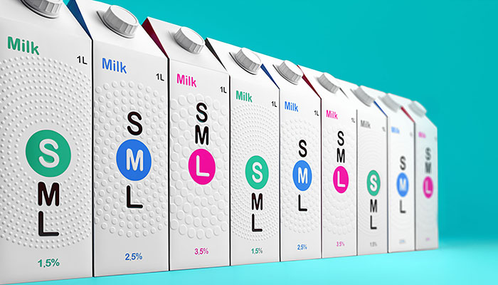
Ultimately there are plenty of amazing things about the print industry and the tactile experience it offers users. Below is an example of accessible print design, in which a milk company has added bold labels and a 3D braille finishing to their cartons, allowing visually-impaired users to identify the products.
While there are many accessibility print solutions, it is apparent that electronic publications offer a different form of accessible aid. Electronic publications offer a solution by those bound by “Print Disabilities” which can be effects of blindness, low-vision, dyslexia, mobility impairment, etc. Statistically, 1 in 8 people struggle to read conventional print, so when only 5% of eBooks are made in an accessible format, this makes it difficult for “print disabled” users to read.
This is why more suitable format should be available such as eBooks, audible readers, podcasts, etc. There are many added benefits and features that make these mediums accessible to users such as; text-to-speech, changing font size and colour, reading in braille and bookmark navigation.
There are many added benefits when considering accessibility in design. The first benefit is that websites are proven to be easier and cheaper to maintain, and they actually rank higher in search engines. Another added benefit is that the more accessible you are, the more users will be able to experience your designs and offer feedback to further improve. The con associated with accessibility in design is that creative options are limited, as there must be strict quality control in order to ensure a standard across all platforms.
Accessible Design Tips
-
Contrast
It’s important that there is a clear distinction between the background and foreground within the design. It’s very trendy to see these low contrast designs such as KKW or Kylie Skin, but it’s not ideal for accessibility. Based on accessibility guidelines, the contrast percentage depends on the foreground object and size. They state that normal text should have a 4.5:1 ratio, whereas larger text (14pt +) should have a 3:1 ratio. A11Y Color Contrast Validator [New Window] allows you to upload images or input colour values to check whether your colour palette is accessible by industry standards.
-
Typography
The next tip is typography, which plays a huge role in accessible design. To start, when choosing the size of the type, it is advised to stay above 12pt and to have the capability to size the type by 200% if required. When looking at typeface families, try to stay away from decorative typefaces as they can be difficult to read. It is also advised that for readability purposes, to use serif fonts for print work, and sans-serif fonts for online work. The font Open Dyslexic [New Window] was designed to help those with dyslexia read large amounts of text.
OpenDyslexic Font
Lorem ipsum dolor sit amet, consectetur adipiscing elit, sed do eiusmod tempor incididunt ut labore et dolore magna aliqua. Ut enim ad minim veniam, quis nostrud exercitation ullamco laboris nisi ut aliquip ex ea commodo consequat.
-
Hierarchy and TOC
This is a great tool to know if you’re making accessible documents or working with Adobe Acrobat for instance. Most applications allow you to make some type of interactive TOC by using Paragraph Styles to organize the document and making accessible for e-readers. Attached is a link on how to use paragraph styles [New Window] and the Interactive TOC tool in InDesign [New Window], just in case you need a refresher. As well, in the Adobe Acrobat program, there’s a great accessible tool that allows you to organize the text and images throughout the document so that e-readers can accurately translate.
-
Imagery
The final tip is related to imagery and graphics. Opacity and sizing are pretty general rules to follow, making sure it’s visible to users as best as possible. Alt-tags are also really important for e-readers to translate the document properly by describing images and graphics. Image Captions are also a great way to make images accessible.
Sources
- https://www.washington.edu/doit/what-difference-between-accessible-usable-and-universal-design#header
- https://www.marsdd.com/wp-content/uploads/2014/01/Towards-an-Accessible-Future-Ontario-Innovators-in-Accessibility-and-Universal-Design1.pdf
- https://www.oreilly.com/library/view/accessible-epub-3/9781449329297/
- http://epubsecrets.com/producing-accessible-ebooks.php
- https://www.rnib.org.uk/information-everyday-living-reading-ebooks-and-digital/accessibility-ebooks
