Part 2 • Class Tutorials
Tutorial 2 • Design for eBooks
Richard Adams; Akos Katona; Bettina Tabel; and Okke Schlüter
User Experience Design (UXD) and “DesignAgility”
Thanks to Prof. Dr. Okke Schlüter, HdM-Stuttgart, for contributing to this section.
When designing eBooks, designers have to think about the purpose of the eBook, the audience, and the readers’ experience as they use it — a process commonly called “user experience design” (UXD). “DesignAgility,” a systematic approach to UXD for media, was created by Okke Schlüter from HdM-Stuttgart and Stefanie Quade (Quade, Stefanie, and Okke Schlüter, DesignAgility—Toolbox Media Prototyping. Amazon Kindle Direct Publishing, 2019). DesignAgility combines “design thinking” with “agile manufacturing.”
The first step in DesignAgility is to think of a challenge or problem that people want to solve. For an eBook, this could include questions like: What is the eBook’s purpose—to inform, persuade, entertain? What is the dominant media—text, photos, videos, animation? Who will the audience be, and what are their characteristics, interests, and possible challenges they may face in reading it?
The DesignAgility approach includes defining “personas,” who are a representative sampling of presumed readers, and their characteristics. The personas’ perception and use of an eBook can be expressed in “user stories.”
| DesignAgility Step | What to Do |
|---|---|
| Discovery | Define the purpose of your eBook: • inform, persuade, entertain? • dominant media—text, photos, videos, animations? |
| Interpretation | Define several “personas,” or presumed users, their ages, occupations, interests, and any sensory challenges they face. |
| Ideation | Write “user stories” about why each persona will be interested the eBook and how they will interact with it. |
| Specification | Sketch out some sample page layouts for your eBook: • cover • first page of chapter • subsequent chapter pages |
| Implementation | Design the eBook |
| Evaluation | Design Critique • show your design to another class member and ask for their feedback. |
| Deployment | Publish the eBook and assess its impact |
DesignAgility Example
Discovery. Define a challenge or problem that people want to solve. An author and designer want to write an informational eBook about cat breeds. The eBook will feature color photos of each breed, along with information about the breed, such as history, origin, characteristics, temperament, medical conditions, nutritional requirements, food preferences, and grooming needs. The photos and text are equally important. The designer wants the eBook to appeal to readers “from 6 to 106.”
Interpretation and Personas. “Granny Smith” is an 86-year-old grandmother who loves cats and reads everything she can find about them. She visits doctor’s offices and complains about the wait times. Her grandchildren bought her a low-cost B&W eReader with WiFi so she could read eBooks while waiting. Granny has some visual challenges, including presbyopia (needs reading glasses to see up close) and the beginnings of cataracts (cloudy vision).
“Junior Jones” is a 6-year-old boy who likewise developed a strong interest in cats. He has an iMac 21″ computer and an iPad Mini that he uses to read eBooks at home and when traveling. Junior loves to see pictures of cats and could benefit from audio on the web site that could read the text to him.
Ideation and User Stories. In the “Cats” eBook, the pictures and text are equally important. The photos should look good in color and when rendered in black-and-white. The text should be high-contrast and enlargeable and be readable with a screen reader or included audio. The pages should look good on both desktop computers and tablets.
Granny Smith likes to look at pictures of cats so the photos should look good in both color and B&W. The photos should be set up as links so that when Granny clicks or taps on an image, the link brings up a larger image. Being able to enlarge the type will make it easier for Granny to read.
Junior likewise enjoys seeing enlarge photos of the cats. As he learns to read, it’s helpful for him to tap a button that reads the text to him.
Writing Your eBook Proposal
- Think about a challenge that you could address with an eBook. What will be more important—text or photos? Describe how you will construct the eBook.
- Define some personas of prospective readers and their characteristics.
- Write a user story for each persona, describing what will interest them about your eBook and how they will interact with it.
- Draw a basic layout of your cover and one of the chapter title pages, including text, full-width photos, and part-width photos with text wrap.
Cover Design
Thanks to Akos Katona, FCAD Catalyst Research Hub, for contributing to this section.
The cover is so important for conveying the title, author, and other information about an eBook. Keep in mind that the title should be visible when viewed as a thumbnail in an eBook catalog.
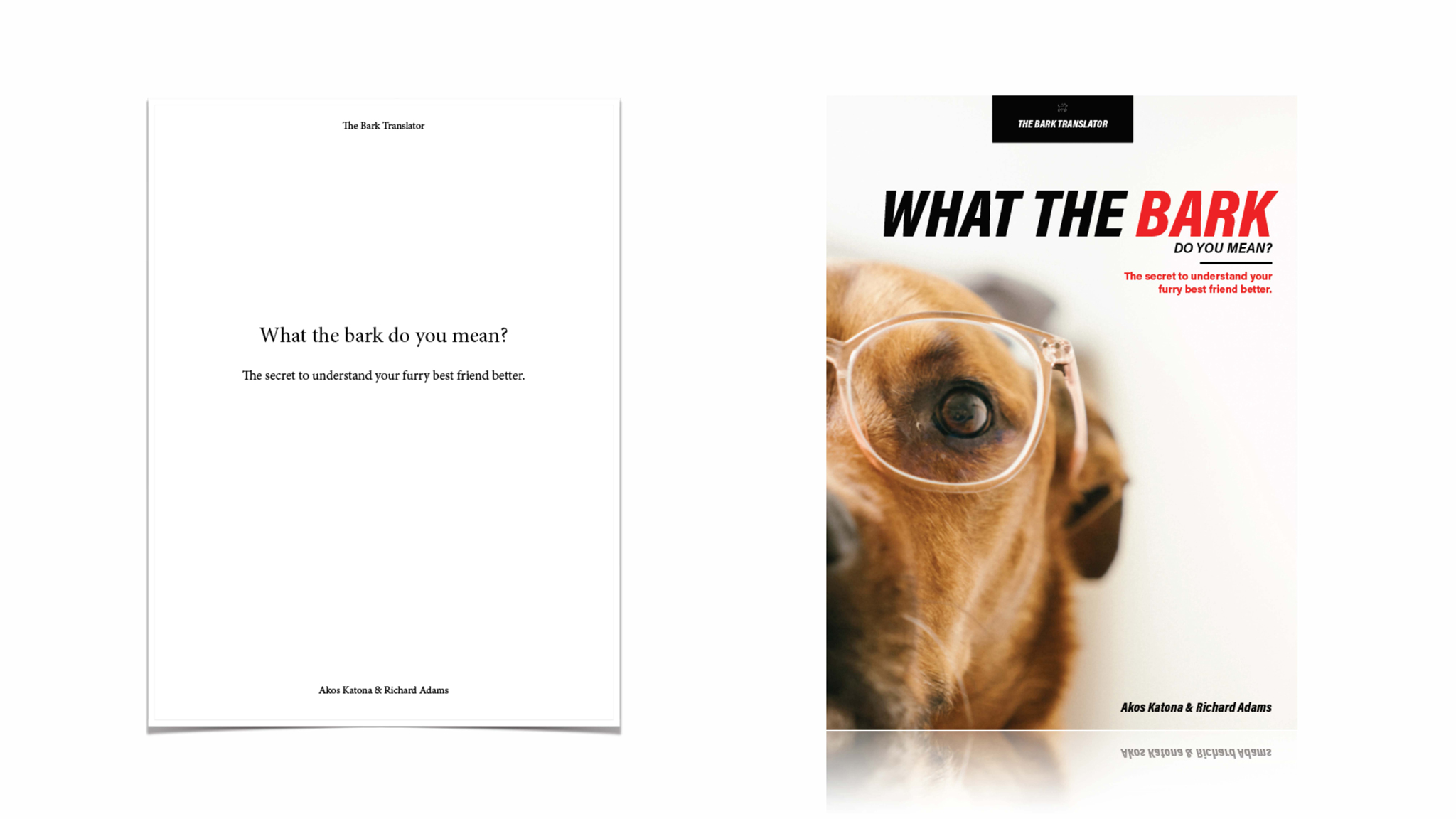
This example shows how, as compared to simple text, an eye-catching cover design can enhance the eBook’s appearance and also convey its message and improve sales.
Research
A key consideration for a cover is the tone of the eBook. For example the sample eBook cover for What the Bark above takes a humorous tone in looking at the psychology of dogs. A popular-market eBook about canine nutrition in health or a veterinary textbook about diseases and illnesses of dogs would take respectively more serious tones.
Designer Akos Katona recommends researching the topic of the eBook and compiling various photos and type faces into a “mood board,” a collage of related photos, fonts, and logos. The mood board can be a valuable tool in exploring the tone that the publisher wants the eBook to take. To compile resources he gets photos from Unsplash [New Window] or Pixabay [New Window], fonts from Adobe Typekit and Google Fonts, and icons and vector artwork from The Noun Project and Vecteezy [New Window].
eBook cover requirements vary by publisher and platform and are constantly evolving as new devices become available. Monica Dube discussed various cover requirements in her January 2019 article, “Complete Guide to Book Cover Sizes—Why Do They Matter? [New Window]”
| Cover Resolution Requirements |
|
| Format | Resolution |
| ePub/Adobe InDesign* | 1024×768px |
| Apple iBooks | 2500px longest side |
| Amazon Kindle | 1600px shortest side |
| Pressbooks | 2500×3750px |
| * author-recommended | |
Following are some recommended steps to design an eBook cover:
Procedure
- Determine the size of cover you need in pixels, e.g., for Pressbooks it’s 2500×3750 pixels.
- Take a photo or choose a royalty-free image that expresses the theme of the eBook. The resolution should be at that required by the eBook format, and the photo should have a lot of white or pale color at the top so the title type can be set with good contrast.
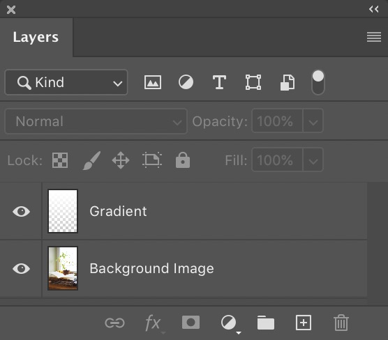
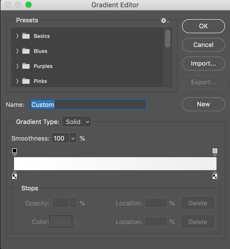
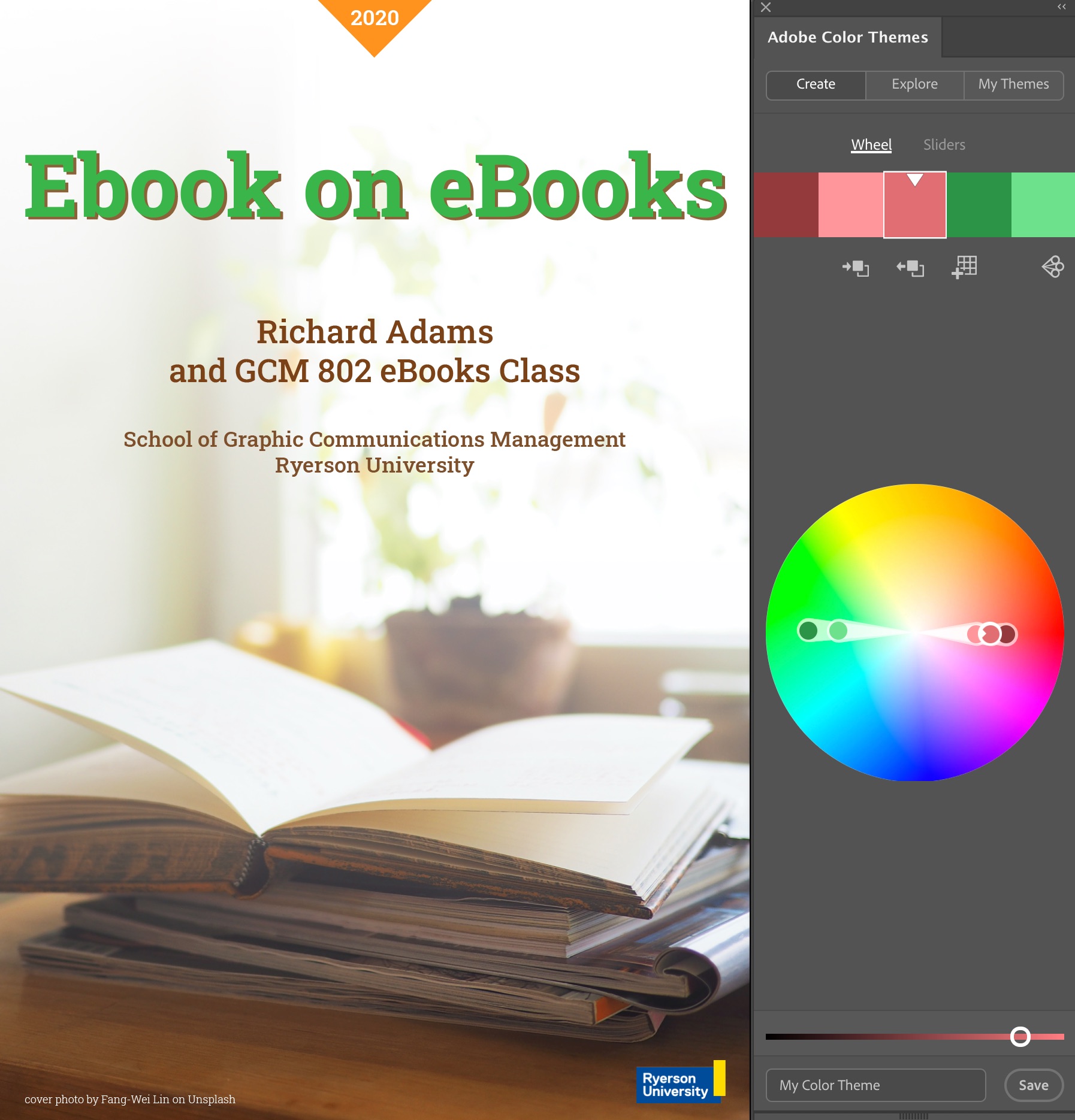
- If the image could stand to be lighter, apply a Gradient Overlay gradient in Photoshop (Layers Palette > fx > Gradient Overlay, see below).
- Import the image into Illustrator and name the layer Background.
- Add another layer on top of the Background and call it Type.
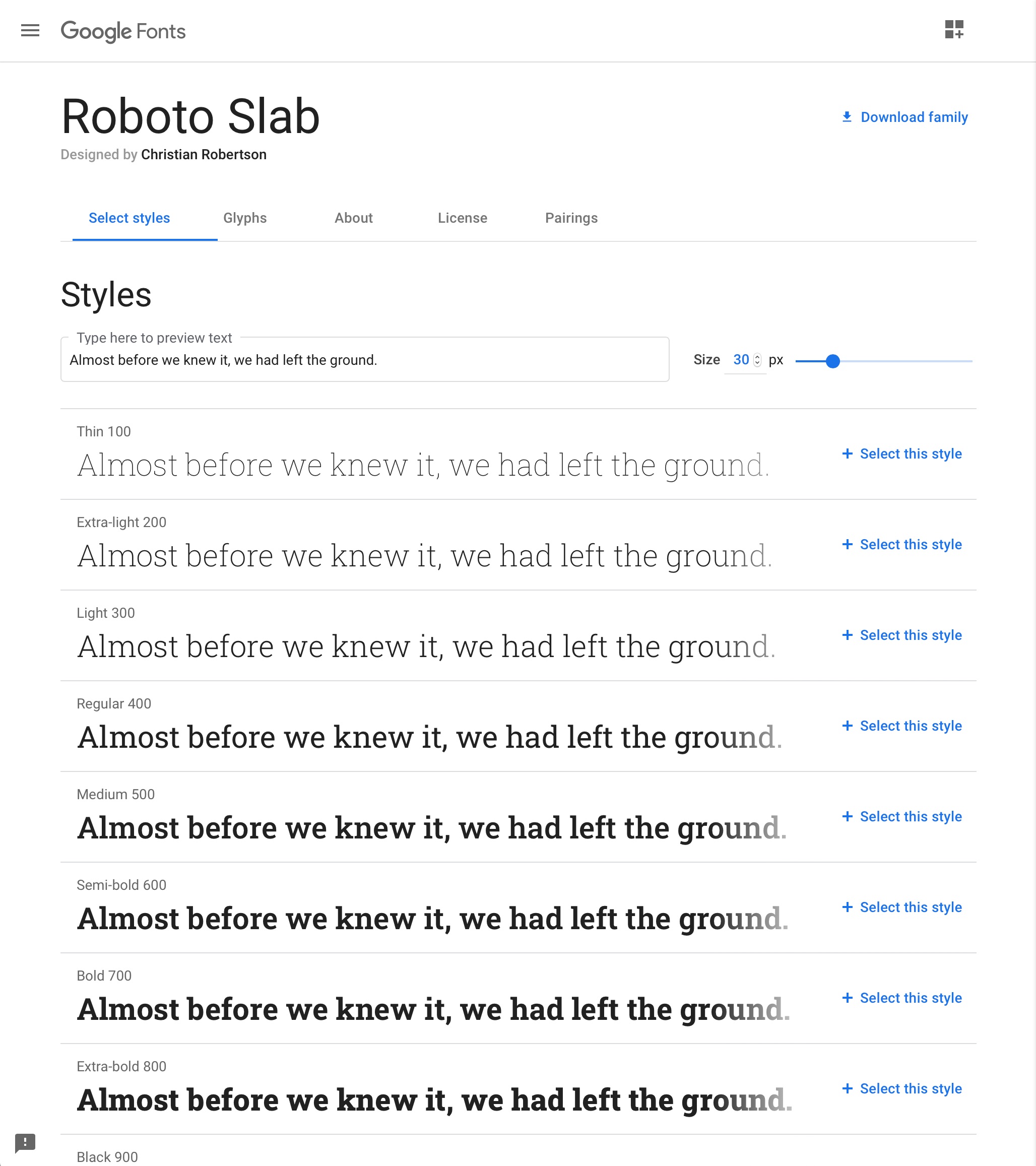
- Choose a royalty-free font (e.g., Google Fonts [New Window]) that conveys the theme of the book and is also easy to read in thumbnail size.
- In Illustrator, pick up (measure) colors from the image using the Eyedropper tool, import into Color Themes, and add several related colors to your Swatches using a scheme of your choice (e.g., analogous, complimentary, triad, . . . ). Use the colors to set the title, author, institution, and other information. (Details below.)
- Make a triangle or other shape at the top or at the corner with the edition or series.
- Export the book cover at the required resolution using the File > Export > Save for Web dialog box.
Photoshop
The following illustrations show how a stock image was prepared for use as a cover photo by applying a gradient in Photoshop to lighten the background, creating more contrast for the title. The original image was 3239×4315 pixels and was exported at 2500×3750 pixels for Pressbooks.
 |
 |
 |
 |
Fonts
Google fonts (google.com/fonts) is a great source of royalty-free fronts to use on eBooks covers.
Illustrator
The edited cover image was placed in Adobe Illustrator and set as the background layer. The color of the orange bookmark was measured with the Eyedropper tool and imported into the Color Themes palette. The Complementary color scheme was selected and the green color was used for the title.
Organizing Files
Compiling multiple versions of photos, fonts, and logos will result in a collection of files that may be linked to page layout or illustration documents. To keep all these assets together and in one place, it’s advisable to create a folder for each cover job.
Design Critique
Thanks to Prof. Bettina Tabel, HdM-Stuttgart, for contributing the idea of design critiques.
When designing a cover or eBook interior page, it can be useful to get a design critique from an objective third party. Following is a list of questions to consider:
Book Cover
- What is the purpose of the eBook? Audience? Is this clear from the title and design?
- From the title and cover photo (if any), are the subject and theme of the book clear?
- Does the color scheme fit the target group and the subject? Should the color scheme be neutral, pastel, bright, complementary, analogous, or other theme?
- Is the font selection appropriate to the eBook’s title and audience?
- Is the font legible (size, contrast)? Could it benefit from a drop shadow or complimentary-colored background?
- If the cover has one or more photos, have the image rights been clarified?
- Are photos sized appropriately to the cover and according to the publisher’s or platform’s requirements?
Interior Pages
- Is the text legible—large enough to read, and with space between paragraphs?
- Are headings distinct and separated from sections?
- Do special effects (drop caps, callouts, sidebars) contribute to the theme of the book without being distracting?
- Are photos large enough for readers to see detail? If the reader touches a photo, does it link to a larger version?
- Are chapter and section separations clearly indicated?
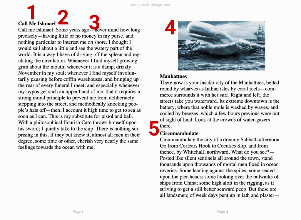
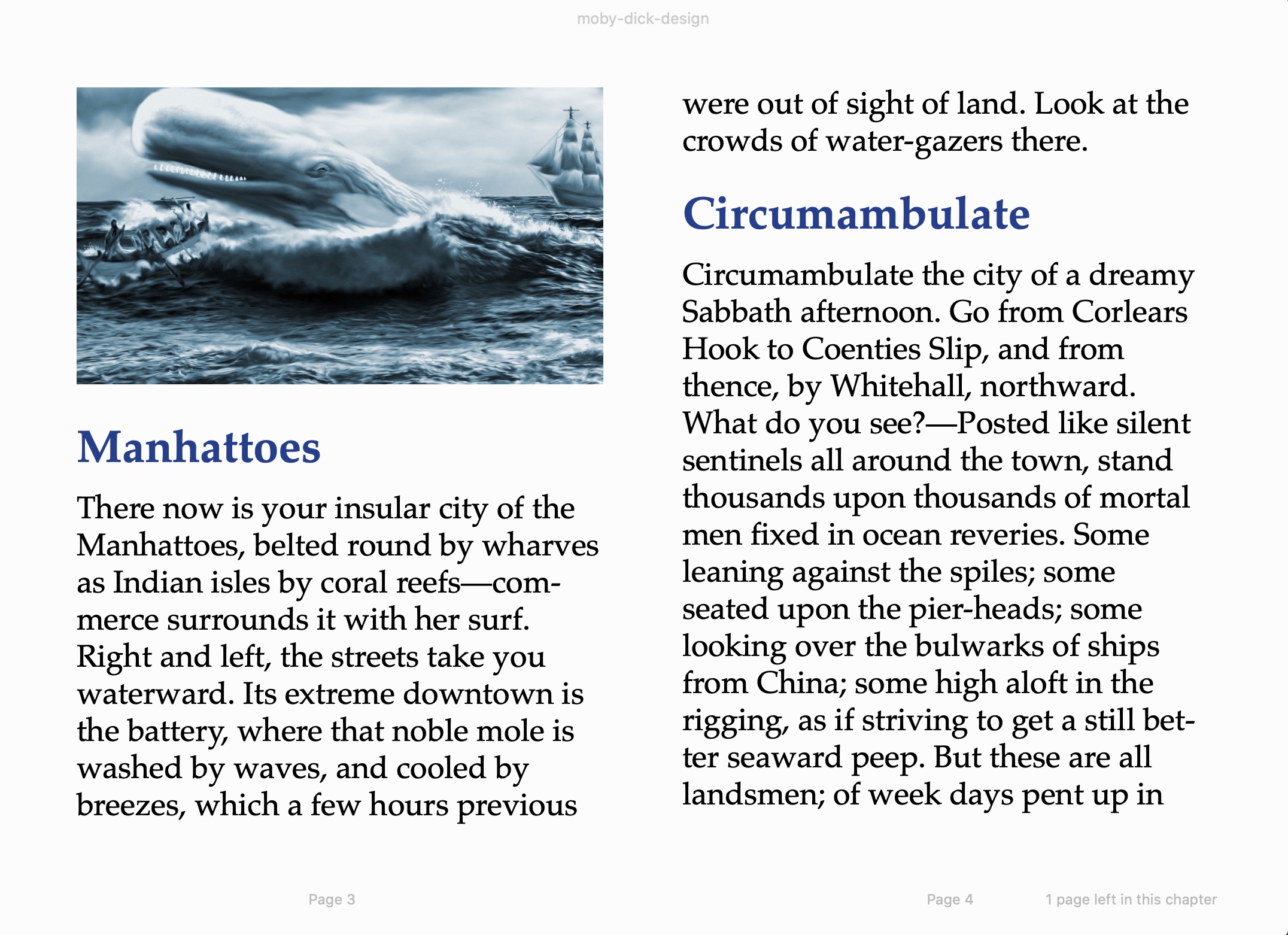
Problems with the example above:
- Small heading and text size in default view
- Insufficient separation between heading and text
- Boring, overused Times Roman font—difficult to read
- Photo should be set to 100% of page width to be easier to see
- Insufficient separation between paragraphs