
Module 1: An Introduction to Data Literacy and Data Visualization
The Data Journey
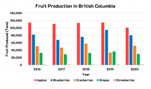
To get started, let’s consider the data visualization[1] in Figure 1.1 below.
The underlying raw data went through many stages before it was presented to you in this data visualization. The information had to be:
- Collected via surveys
- Inputted into a database
- Stored on secure servers
- Cleaned for accuracy and consistency
- Analyzed to understand the trends
- Presented as a bar graph
It is likely that multiple people, with complementary areas of expertise, worked on turning the raw dataset into a well-presented data visualization.
Deeper Dive
Watch this 4min video from Statistics Canada to learn more about the data journey: The Data Journey: What you need to know for successful navigation
- Statistics Canada. Table 32-10-0364-01 Area, production and farm gate value of marketed fruits. Data is reproduced and distributed on an "as is" basis with the permission of Statistics Canada. Retrieved January 9th, 2022. DOI: https://doi.org/10.25318/3210036401-eng. Statistics Canada Open Licence: https://www.statcan.gc.ca/en/reference/licence ↵
