
Module 2: How to Critically Analyze and Interpret Data Visualizations
Step 5: Step Back to Spot Patterns and Relationships
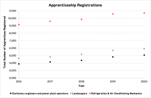
Now that you’ve spent some time identifying the features that support the data visualization (the scaffolding) and how the content itself is represented (visual encoding), you’re ready to step back and look for patterns, relationships and trends in the data. Figure 2.7[1] below displays an increase in data.
Some patterns or relationships may be immediately obvious, and others may take more time to make sense of.
Again, take your time.
- Statistics Canada. Table 37-10-0079-01 Registered apprenticeship training, registrations by major trade groups and sex. Data is reproduced and distributed on an "as is" basis with the permission of Statistics Canada. Retrieved February 2nd, 2022. DOI: https://doi.org/10.25318/3710007901-eng. Statistics Canada Open Licence: https://www.statcan.gc.ca/en/reference/licence ↵
