
Module 2: How to Critically Analyze and Interpret Data Visualizations
Step 3: Focus on Scaffolding
Type of Data Visualization
To get the background information you need to interpret a data visualization, start by focusing on its scaffolding and considering some of the following questions:
- Is the chart appropriate for the data?
- Does the format enable clear comparison of the data?
The type of chart will determine the questions you need to ask, so there may be more questions to consider.
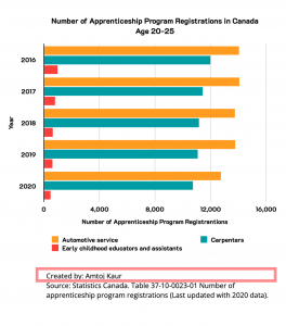
For example, review Figure 2.1[1] below. What type of data visualization is this? Focus on the content highlighted in the graph area.
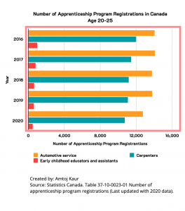
Title
Next, consider some of the following questions as you review the data visualization’s title:
- Is there a title?
- Does the title tell you what to expect from the chart?
- Does the chart support the title?
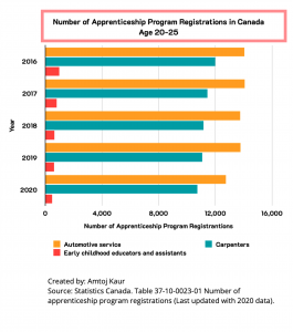
For example, review the title in Figure 2.2 below (found above the graph area).
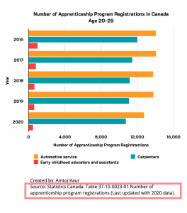
Key/Legends
Next, consider some of the following questions as you review the data visualization’s key/legends:
- Is there a key?
- Does it explain the features of the data visualization (colours, shapes, etc.)?
- Are data points labelled?
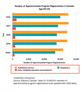
For example, review Figure 2.3 below for the information in its key/legend (found below the graph area).
Scales
Next, consider some of the following questions as you review the data visualization’s scales:
- What are the scales?
- Do they start at zero? [Note: there are lots of good reasons to not start the scale at zero, but pay attention to it!]
- Are the scales complete?
- Are the axes appropriate for the data?
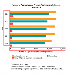
For example, review information in the scales for Figure 2.4 below (which run across each of the two axes of the graph).
Bylines
Next, consider some of the following questions as you review the data visualization’s byline:
- Who made the data visualization?
- Did they also collect and analyze the underlying data?
For example, review information in the byline for Figure 2.5 below (which is found below the key/legend for the graph).
Sources
Next, consider some of the following questions as you review the data visualization for its source:
- Is it clear where the data come from?
- Is the source reputable? (More on this in the next module!)
For example, review information in the source for Figure 2.6 below (which is found below the source information).
After reviewing the data visualizations scaffolding, you should have a better sense of what the visualization is trying to convey and are ready to dive into analyzing the content.
- Statistics Canada. Table 37-10-0079-01 Registered apprenticeship training, registrations by major trade groups and sex. Data is reproduced and distributed on an "as is" basis with the permission of Statistics Canada. Retrieved February 2nd, 2022. DOI: https://doi.org/10.25318/3710007901-eng. Statistics Canada Open Licence: https://www.statcan.gc.ca/en/reference/licence ↵
